New in Sulu 1.4: Redesign of the Media section
In the latest release of Sulu, we spent a lot of time working on the Media section. We did some pretty cool redesigns which I'd like to show you today.
Good bye sidebar, hello tiles
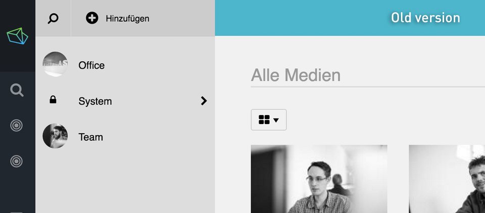
Previously, there was a grey sidebar right next to the main navigation. You could use this sidebar to navigate through the media folders, but it was a bit cumbersome. In Sulu 1.4, we replaced the sidebar by a new tile view. Browsing the media section now feels just like browsing the files on your operating system.
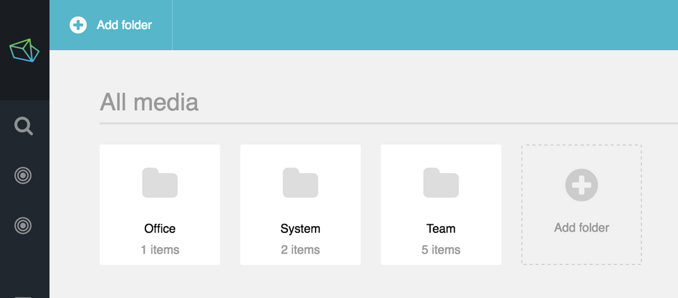
Each tile displays the number of files the folder contains. It's super easy now to distinguish empty folders from full or even very large ones without doing a single click.
New breadcrumbs
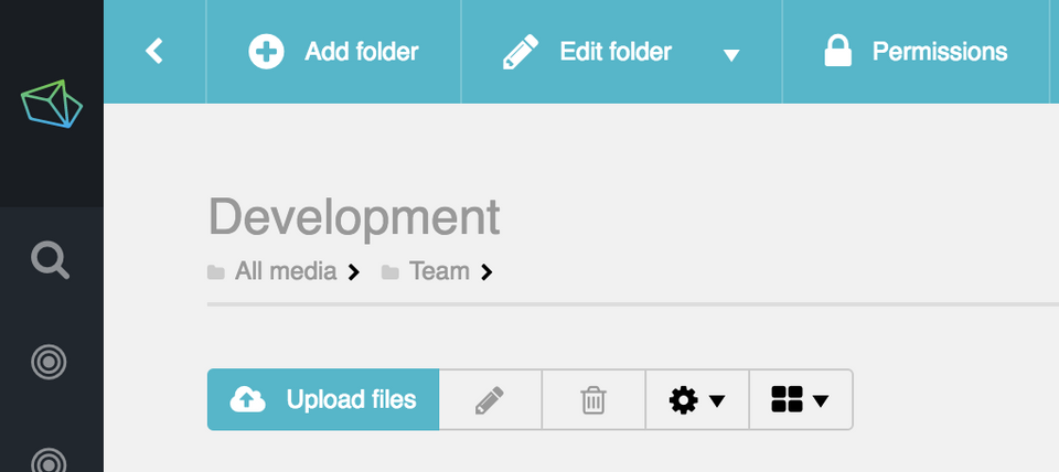
The media section now includes a breadcrumb under the title of the folder. By looking at the breadcrumb, you always know where you are – even if you are in a huge tree of folders.
Polished masonry view
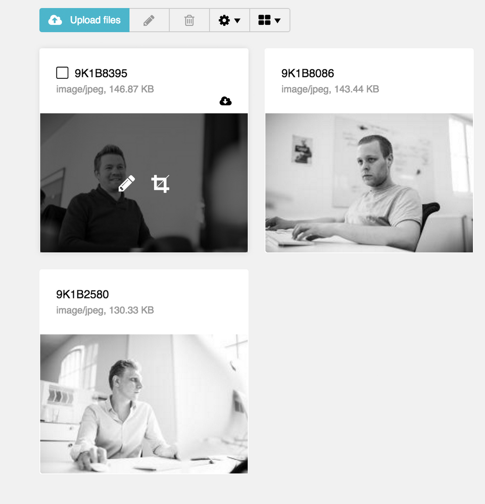
The masonry view that displays the contents of a directory got a little facelift. We added a dark hover effect to each file, which gives you direct access to frequently needed functionality (modifying and cropping the image, but more on this new feature in a separate blog post).
Refined preview images
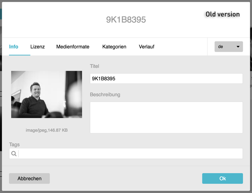
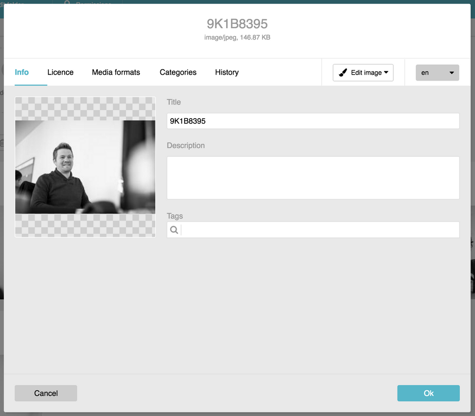
When you open an image, an overlay appears that displays a preview image and fields for editing information about the image. In this overlay, the borders of the preview image never match the other visual elements. Depending on the dimensions of the image, its borders vary and disturb the overall look. We fixed this by putting the preview image into a squared box surrounded by a delicate border. The background of the box is shown in grey tiles – a representation that should be familiar from Photoshop and similar applications. Overall, the overlay appears much more calm now than it did before.
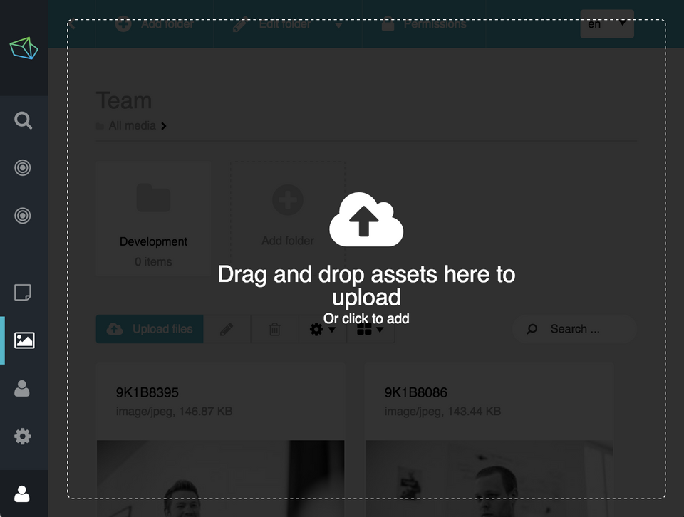
Clearer drag & drop overlay
The drag & drop overlay, which appears when dragging files into the admin UI, also got a new design. The new dark full-screen overlay with a subtle dashed white border clearly communicates that the whole screen can be used to drop the files.
That's it for today. Enjoy the pictures and stay tuned for 1.4!
