The new Sulu interface
A user friendly and economic interface has always been an important part of the Sulu platform. The system should not only enable devs to create complex websites but also make it as easy as possible for editors to work on the web content. We have learned tremendously from user feedback and many client projects from our parent company MASSIVE ART. And we used this as the basis for a re-design of the UI which is now released with Sulu 1.1.
A new economic approach
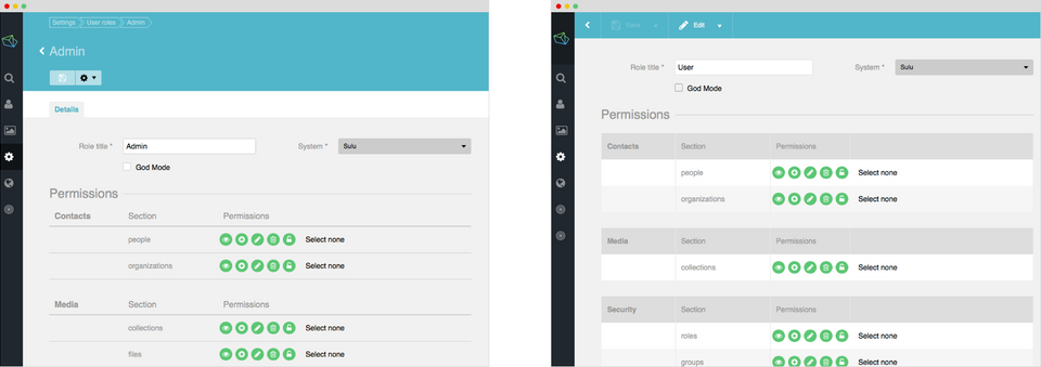
Interface design has always been a fight between aesthetic and ergonomic. What looks good must not necessarily work good and especially for so called “heavy” users an interface is a working tool that should provide quick access to important features.
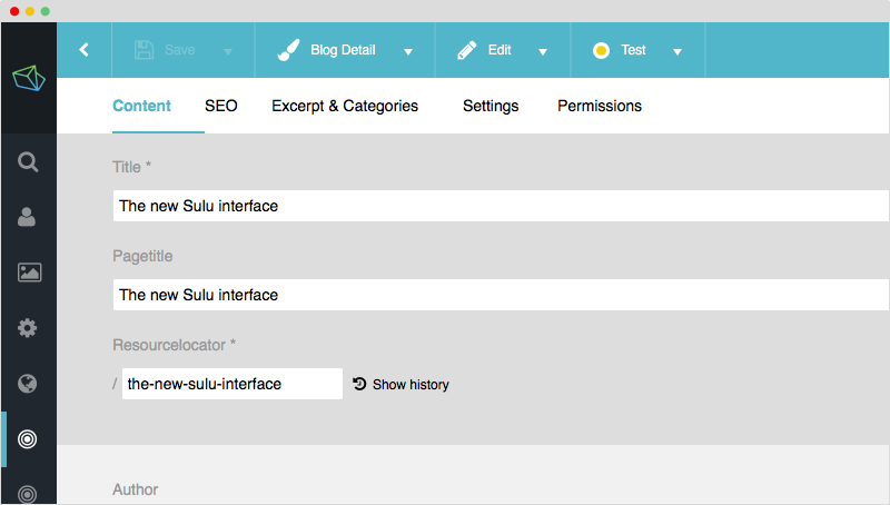
“Use space wisely” was the leading mantra for the re-design. A good example is the big blue header bar on top of the content area. We gained a lot of additional space by reshaping the bar, repositioning the headline and getting rid of the breadcrumb (no one was using that anyway).
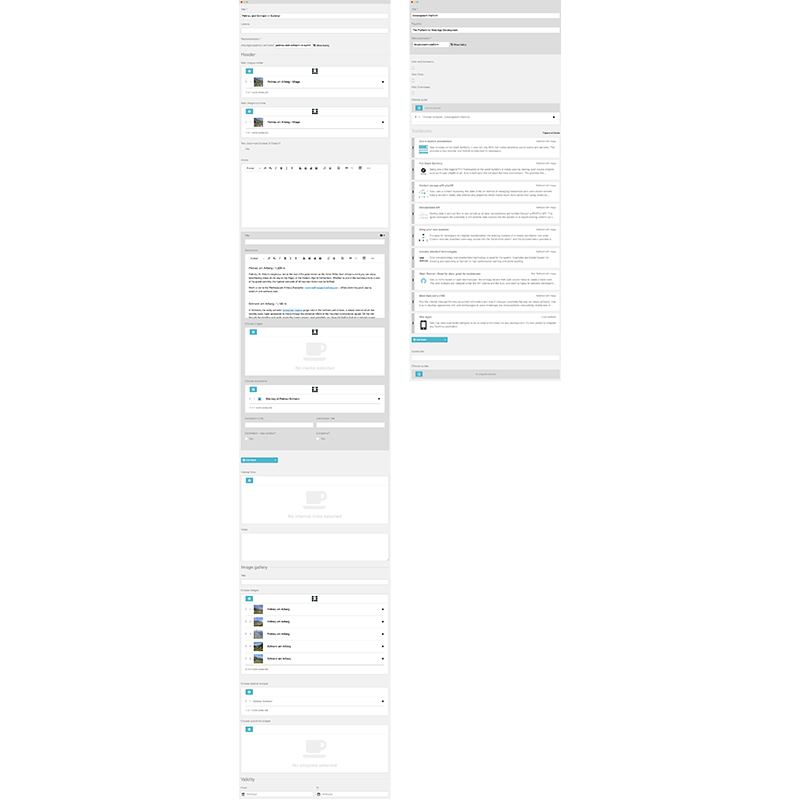
Another big issue was the style of the forms, mainly in the content management section. Since the different sections of a template are managed by individual content-types (which are basically combinations of form elements) larger web-designs require a great number of form fields which ends in very long and complex interfaces. As a result editors have to scroll, scroll, scroll…
The new interface now allows content types to be compressed when they are not in use. This give a much better overview of the template sections and the need for scrolling has been dramatically reduced.
Custom interfaces for core modules
Sulu comes with 4 core module bundles (Contacts, Assets, Settings, Webspaces) that share the same interface design. Until now! With the new version custom interfaces have been introduced to support editors in their data administration.
Contacts
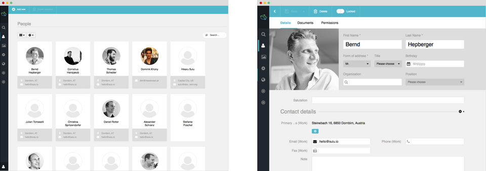
The overviews for people and organizations have now a card view that display the most important information. The detail view has a new and improved layout. (We talk about the new form layout later in this article)
Assets
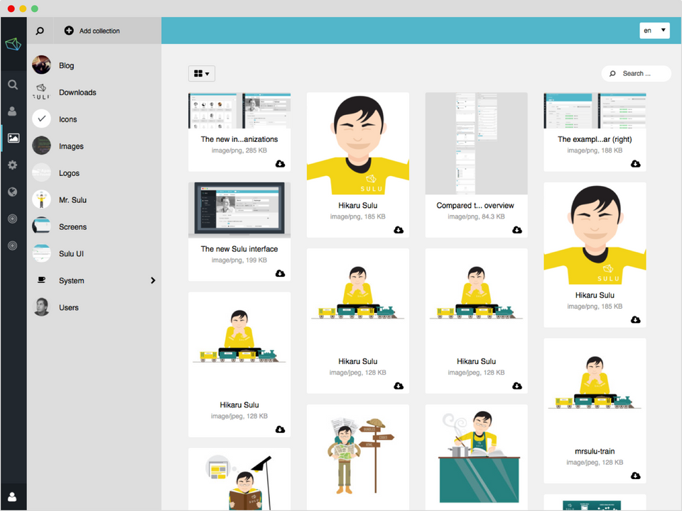
The assets module was completely re-designed. It now appears much brighter and more friendly. A masonry view shows images without the need of cropping them to a square dimension (think Pinterest).
Webspaces
The most important change here is the "compressed" content types (mentioned above). But the newly designed preview bar is also worth mentioning.
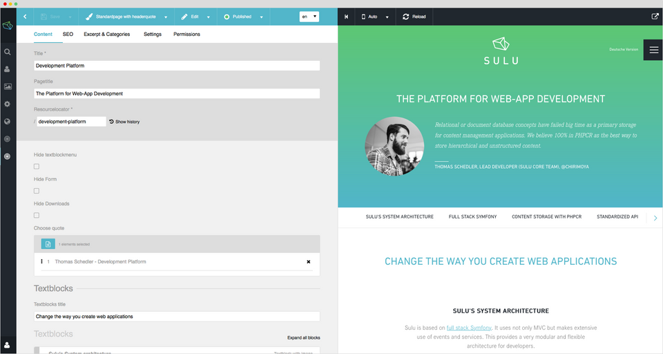
Improved form architecture
Forms are a very important part of content administration. Any data we edit is more or less managed within a form field.
We felt the need to give more possibilities to structure large forms so editors have important information quickly accessible. This is why we introduced the form header section where the most essential data-fields can be placed.
Since the header bar with the title is now gone there is also the need to display the form fields that are used to create the data title. These fields can be displayed significantly larger than the other fields to mark the data title clearly. We encourage you to make use of this features in your custom modules!
It’s all in the details
There is much more to this re-design than the big and bold we’ve talked about. Many details have been re-worked and improved such as the tab bar, the overlay dialogues or the side navigation. Sulu now has a much more compact UI, works faster and gives you more space for the essential: The content.
